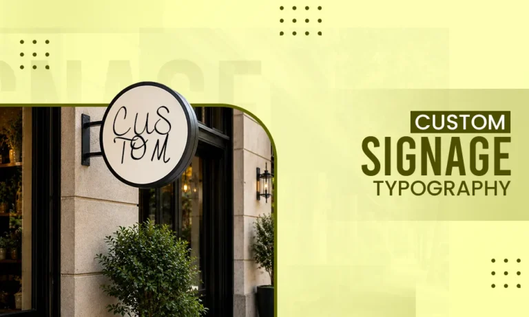
Typography is the one which determines whether business communicates in second or just disppears into visual noise. A sign may use bold colours and costly materials. But what makes it difficult to read is poor letterformations, spacing, contrast in colours. This can make the typography difficult to read from afar.
Good signage typography must be designed after analyzing real-world conditions instead of relying on screen. There are some of the important things that businesses should keep in mind for example letter height,stroke width, spacing, illumination, fabrication method,and sign dimensions. Businesses should also consider the amount of time customers have to read the message.
Choose Fonts for Distance Legibility
Decorative typefaces can boost brand identity, but they often become difficult to read when viewed from across a street or from a moving vehicle.
For primary information, favor fonts with clearly differentiated letterforms. Characters such as I, l, 1, O, and 0 should remain recognizable at the expected viewing distance.
Typography also requires enough internal space. Fonts with extremely narrow counters, which are the enclosed spaces inside letters such as “a” and “e,” can visually shut when reproduced at small sizes or under bright illumination.
Visuals Clipping similarly flags typography, readability, and visual hierarchy as important considerations in environmental and signage-oriented graphic design.
Match Typography to the Sign Technology
A font that works in print may not translate properly to an illuminated or fabricated sign.
Very thin strokes, tiny gaps, and intricate serifs can become difficult to produce or illuminate consistently. Letterforms need enough physical structure to hold their intended shape after production.
This is particularly important with custom neon signs, where lettering must convert into illuminated tubing or a comparable fabricated form. NeonSignsNow offers customers to customize text, fonts, colors, and uploaded artwork, making typography a direct part of the sign-production process.
The final font choice should therefore be assessed as fabricated signage, not simply approved as a digital logo.
Build a Clear Typographic Hierarchy
Most business signs should present information in a defined order.
The company name usually gets the strongest visual emphasis. A short service descriptor, location message, phone number, or call to action should take secondary level.
Avoid giving every line the similar font size and weight. When every element requires equal attention, customers have no obvious entry point.
Limit the Amount of Information
A storefront or roadside sign is not a catalog.
The main message may need only:
- Business name
- Core service or category
- Short call to action
- Essential contact information
Long lists of services shrink usable letter size and increase reading time.
Control Kerning and Tracking
Letter spacing has a major impact on sign readability.
Kerning controls the space between specific letter pairs, while tracking adjusts spacing across an whole word or line. Both should be checked manually for prominent signage.
Default software settings can make awkward gaps around combinations such as AV, WA, To, and Yo. These inconsistencies become extremely visible when letters are enlarged to several feet in height.
Extremely tight tracking is often risky. Adjacent letters may blend visually from a distance, especially with illuminated signs or bold typefaces.
Increase spacing enough to keep individual letterforms without making the word appear disconnected.
Use Contrast to Protect Readability
Good signage needs sufficient separation between lettering and its background.
Color difference alone does not ensure readability. Two colors can appear distinct while sharing similar brightness values, causing the lettering to lose definition from a distance.
Preview the design in grayscale. If the text and background become difficult to distinguish, the luminance contrast may be too weak.
Outdoor conditions make contrast particularly crucial. Sunlight, reflections, shadows, rain, headlights, and surrounding advertising can all impact visibility.
Test Letter Weight at Actual Size
Computer screens can make crisper typography appear sharper than it will in physical production.
Printing, illumination, cutting, and fabrication can alter how strokes are perceived. Very light fonts may vanish at distance, while extremely bold fonts can cause counters and internal spaces to close.
Order a physical sample or print a scaled section of the design when possible.
The goal is not automatically to choose the boldest font. It is to pick enough stroke weight for reliable visibility while preserving the structure of each character.
Design for the Available Viewing Time
Typography for a pedestrian-facing storefront can hold more detail than typography intended for passing motorists.
Someone standing outside a restaurant may get several seconds to read a sign. A driver traveling through a commercial corridor has far less time.
Shorten the message as viewing speed rises.
The most important wording should be recognizable before secondary information needs to be absorbed.
This principle also impacts outdoor promotional displays. Large-format yard sign letters are offered in 18-inch and 24-inch formats, illustrating how physical letter scale becomes part of visibility planning for lawn and roadside displays.
Protect Negative Space Around the Message
Typography requires room to work.
Letters placed too close to sign edges can seem cramped and may be affected by mounting hardware, frames, landscaping, or surrounding architectural elements.
Keep consistent margins around the primary message. Space multiple lines enough that ascenders and descenders do not create visual collisions.
Negative space also stregthen hierarchy because it allows important words to stand apart from secondary information.
Check the Complete Installation Environment
Before approving typography, review:
- Viewing angle
- Mounting height
- Nearby signs
- Building color
- Landscaping
- Daylight conditions
- Night illumination
- Typical viewer distance
A layout that looks balanced on a white design canvas may behave very differently against brick, glass, vegetation, or a crowded retail facade.
Keep Brand Typography Consistent Without Being Rigid
Businesses often want signage to use exactly the same typography as their logo or website.
Consistency is useful, but environmental readability may demand adaptation. A thin brand font may perform perfectly on packaging but fail on a large illuminated exterior sign.
Build a signage typography system rather than forcing one font into every application.
The primary brand typeface can remain part of the identity while a more readable companion font covers addresses, directions, service descriptions, operating hours, or temporary promotions.
Prepare Production-Ready Lettering
Final signage artwork should be submitted in a format appropriate for fabrication.
Vector lettering is generally preferred for logos and typography because it can be scaled without introducing pixelation. Switch fonts appropriately when required so production vendors are not dependent on having the same font files installed.
Inspect outlines carefully after conversion. Look for distorted curves, overlapping shapes, tiny gaps, and unnecessary anchor points.
Also secure a final proof before fabrication. Yard Sign Plus, for example, supplies proofs for custom yard-letter designs before production, reinforcing the importance of reviewing the physical sign configuration rather than relying only on the original artwork.
Design Typography for the Real Viewing Environment
So, the idea that most uniques font is important for best typography is not always true. What makes the brand system recognisable is the type system.
Always select fonts for distance legibility, control kerning and tracking. Try to use strong contrast and match the stroke weight to the fabrication method. Don’t use unnecessary words and sentences. And Most importantly, always review the typography in places where customers can actually see it.
The success of sign depends on how people easily perceive the business, understand the message and know exactly what to do without having any doubts and second thoughts on decoding the design.
Frequently Asked Questions
Q1. What is a good font for business signage?
Ans: The good fonts of businesses are Helvetica, Arial, and Futura.
Q2. What fonts attract Gen Z?
Ans: Serif fonts because of its traditional typographic elements attract Gen Z.
Q3. Which fonts are trending now?
Ans: Fonts like Instrument Sans, Rethink Sans, and Quintessesntial are trendin now