A thumb moves down a phone screen faster than anyone would admit, skipping past dozens of nearly identical little squares. Most of them blur together: same white background, same angle, same flat lighting. Then one stops the scroll, and the person behind the thumb doesn’t fully know why.
That half-second decision is the entire game. Nobody reads a title before deciding whether to tap, and nobody scrolls back up to give a skipped photo a second chance. The image decides first, every time.
This is what separates the listings that get opened from the ones that get scrolled past, and how to use the image of Etsy product listing design actually gives sellers an edge instead of wasting most of them on repeats.
Most Listings Lose in Under a Second
Most listing photos lose before anyone reads a word. Not because the product is not good — because the first image wants a buyer to do work the thumbnail should have done for them: squint, guess the scale, figure out what they’re even looking at.
A thumbnail has to answer “what is this and is it for me” before it answers everything else. That’s a much smaller job than most sellers offer it. Busy backgrounds, mid-action crops, props that compete with the product — all of it includes friction at the exact moment friction is most costly.
Fix the first image particularly, not the gallery generally. The other nine photos get judged later, by someone who already assumed to click.
Give Each of the Ten Slots a Job
A seller who photographs one angle, then photographs it again from two inches to the left, then calls that a ten-image gallery has used the slots Etsy gives them to repeat only a piece of information nine extra times rather than answering nine different questions a buyer actually has before checkout.
Each slot should earn its place: hero shot clean and centered, scale shot with a hand or a common object for reference, detail shot on texture or stitching or engraving, a shot revealing the product in actual use, packaging if that’s just part of the appeal, and a shot answering whatever question shows up most in reviews or messages — color accuracy, size discrepancy, what’s included.
If two slots would show the same information from a little different angle, cut one. A gallery that runs out of things to say at slot six is doing its job. A gallery padded to ten for the sake of the number isn’t. Six sharp beats ten repeats.
Clean Backgrounds, Real Light, and the Noise That Kills Clicks
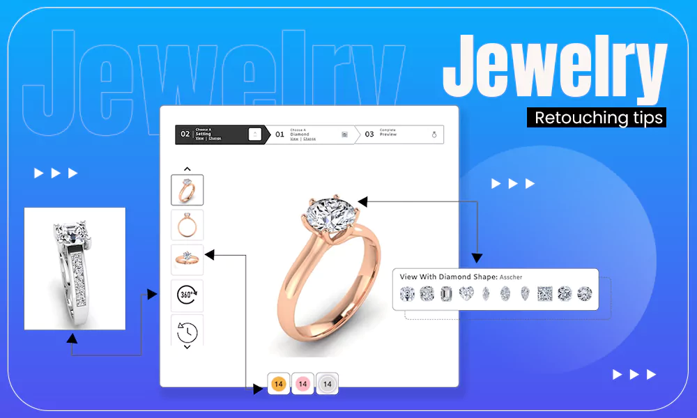
Backgrounds and lighting don’t get noticed when they’re done right, which is exactly why they’re easy to get wrong without noticing it. A cluttered desk corner, a shadow cutting across the product, a white balance that turns ivory jewelry a little blue — none of it reads as “mistake” to the seller who’s looked at the photo fifty times already.
Soft, even light beats a bright flash almost every time, because flash flattens texture that’s usually the actual selling point — the grain in wood, the facets in a stone, the weave in fabric. A single window with scattered daylight does more work than most ring lights, at no cost.
Clean doesn’t mean sterile. A simple background with one well-placed prop still reads as intentional; a plain background with three unrelated objects reads as clutter that occurred by accident.
Showing Scale Without Overdoing It
Buyers guess wrong about size regularly. A wrong guess about size doesn’t surface until after delivery, and by then it isn’t feedback — it’s a return, not a repeat customer. A ring photographed alone against a plain background gives no sense of whether it’s delicate or chunky.
A hand, a coin, or a ruler in just one of the ten slots solves this. It doesn’t need to appear twice. Not the hero shot, either. Scale is information, not the core pitch.
The Mistake-to-Fix Table
Here are some of the common mistakes that should be taken care:
| Common Mistake | Why It Costs Clicks | Quick Fix |
|---|---|---|
| Same angle repeated across slots | Wastes slots that could answer new questions | Give each slot a distinct job |
| Harsh direct flash | Flattens texture, washes out color | Use soft diffused daylight or a softbox |
| No scale reference anywhere | Buyer guesses size, often wrong | Add one scale shot with a hand or coin |
| Busy or mismatched background | Competes with the product for attention | Plain background, one deliberate prop |
| Only studio shots, no context | Buyer can’t picture owning it | Add one lifestyle or in-use shot |
Most of these fixes don’t need new equipment. A background eraser like the one built into Photoshop can clean up an inconsistent backdrop after the fact, which matters more than it should for sellers shooting on a kitchen table instead of in a studio.
What Separates a Click from a Scroll
None of this is about having better products or a larger budget. It’s about treating ten image slots as ten separate jobs rather than one job repeated badly ten times, and giving the first photo the one piece of work it actually has to do.
A listing with six honest, purposeful photos often outperforms one with ten repetitive ones. Fewer, sharper decisions beat more of the same decision.
FAQs
1. How many product photos should an Etsy listing actually use?
Ans: Up to ten is available, but there’s no rule requiring all ten. Use as many as it takes to answer a buyer’s real questions, and stop once you’re repeating yourself.
2. Does the first photo really matter more than the rest?
Ans: Yes. It’s the only one shown in search results and the only one a buyer sees before deciding whether to click at all. The other nine only get seen after that decision is already made.
3.Do I need professional photography equipment to fix most of these mistakes?
Ans: No. Lighting and background problems are usually fixable with a window, a plain backdrop, and basic editing — not a studio upgrade.
4. Should every photo be shot on a plain white background?
Ans: No. A clean background matters most for the hero shot. At least one lifestyle or in-use photo, with context around it, helps buyers picture owning the product.